Suncoast Web Solutions
 25th Oct, 2024
User experience is crucial in website design. A well-designed site not only attracts visitors but also encourages them to engage with your content. On the other hand, a poor user experience can result in high bounce rates and decreased user satisfaction.
Common web design mistakes that hinder engagement include:
- Unclear Calls to Action (CTAs): Ambiguous prompts can confuse users.
- Complicated Navigation: Difficult-to-use menus can frustrate visitors.
- Inadequate Responsive Design: Failing to optimize for various devices alienates mobile users.
To improve user experiences, avoid these Top 5 Mistakes to Avoid in Website Design for Better User Experience. By addressing these common web design mistakes, you can enhance usability and keep users returning to your site, especially when considering options like Website Design on Sunshine Coast.
1. Lack of Clear Call to Action (CTA)
A Call to Action (CTA) is a prompt that encourages users to take a specific action on your website, such as signing up for a newsletter, making a purchase, or downloading a resource. CTAs are crucial as they provide user guidance and direct visitors toward desired actions, ultimately increasing engagement and conversion rates.
Effective vs. Ineffective CTAs
- “Get Your Free Trial Now”: This creates urgency and offers value, compelling users to act immediately.
- “Join Our Community”: This fosters a sense of belonging, encouraging users to sign up.
Examples of Ineffective CTAs:
- “Click Here”: Vague and does not convey any benefit or urgency.
- “Submit”: Lacks motivation and fails to inform users what they gain from clicking.
The difference in user engagement levels between these types of CTAs is significant. Clear and compelling CTAs can lead to higher click-through rates and conversions, while vague prompts often result in user disengagement.
Strategies for Crafting Persuasive CTAs
- Be Clear and Direct: Use straightforward language that tells users exactly what to expect.
- Create Urgency: Phrases like “Limited Time Offer” or “Act Now” encourage immediate action.
- Use Contrasting Colors: Make your CTA stand out visually against the rest of your page to draw attention.
- Position Strategically: Place CTAs where users naturally look, such as at the end of an article or prominently on the homepage.
- Test Different Versions: A/B testing different CTAs helps determine which message resonates best with your audience.
Incorporating these strategies into your web design not only enhances usability but also boosts overall conversion rates by effectively guiding users through their journey on your site.
2. Poor Navigation Structure
A well-designed navigation system is essential for ensuring a seamless user journey. When users can effortlessly access information, they are more likely to engage with your website and find what they’re looking for. An intuitive navigation structure enhances website usability, reducing the frustration that often leads to site abandonment.
Common navigation issues include:
- Unclear menus: Vague or overly complicated labels can confuse users, making it difficult to identify where to click next. It’s crucial to follow best practices for menu design to ensure clarity and usability.
- Excessive links: Too many options can overwhelm visitors, causing them to feel lost and frustrated.
These pitfalls hinder users’ ability to navigate efficiently through your site. A disorganized navigation structure can result in high bounce rates as users abandon the site in search of better alternatives.
Tips for Creating an Intuitive Navigation Structure
To improve your website’s navigation, consider implementing the following strategies:
- Use Descriptive Labels: Ensure each menu item clearly conveys its content. Instead of vague terms like “Services,” opt for more specific labels such as “Digital Marketing Services” or “Web Design Packages.”
- Organize Content Logically: Arrange your content in a way that aligns with user expectations. Group related topics under overarching categories, creating a hierarchy that makes sense.
- Limit Menu Items: Aim for simplicity by keeping the number of top-level menu items between 5-7. This prevents overwhelming visitors while still providing access to critical sections of your site.
- Implement Breadcrumbs: Breadcrumb navigation allows users to track their location within your site easily. This feature not only improves usability but also aids in backtracking without losing context.
- Test Your Navigation: Conduct usability tests with real users to identify pain points in your navigation structure. Gather feedback and make necessary adjustments based on their experiences.
Applying these tips will enhance your website’s intuitive design, streamline user interactions, and ultimately lead to a more positive overall experience. Prioritizing navigation is crucial in avoiding one of the Top 5 Mistakes to Avoid in Website Design for Better User Experience.
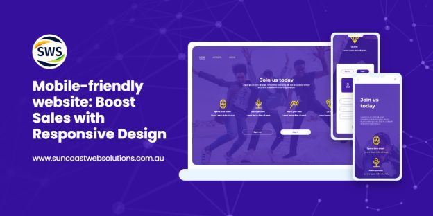
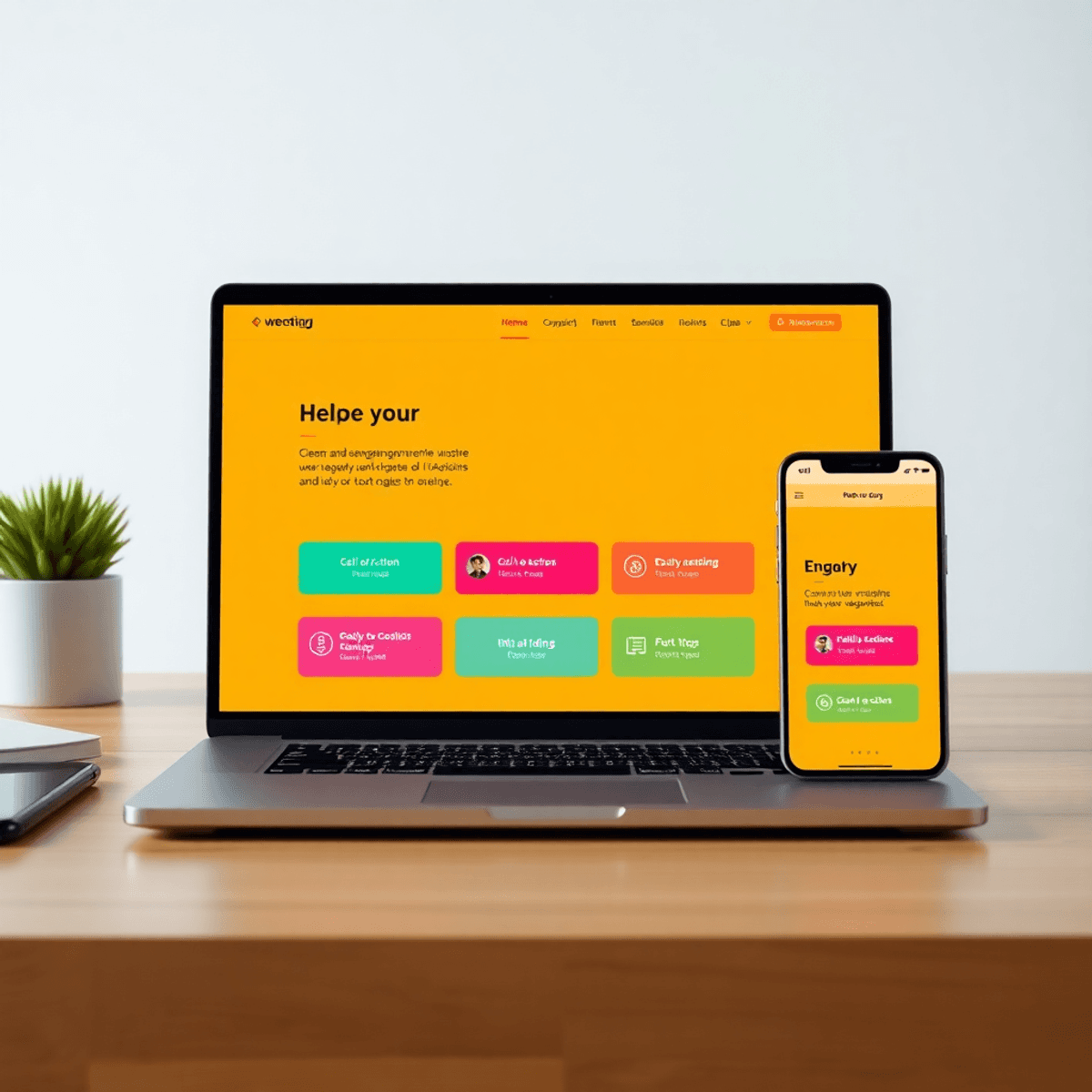
3. Neglecting Responsive Design Principles
Responsive design is crucial in today’s mobile-driven world. Users expect websites to function seamlessly across various devices, from smartphones to tablets and desktops. A responsive design enhances user experience by ensuring that content adjusts smoothly to different screen sizes. This adaptability not only improves usability but also reflects a modern approach to web design.
Consequences of Ignoring Mobile Users in Web Design
Neglecting mobile optimization can lead to several negative outcomes for businesses:
- Increased Bounce Rates: If your website is not mobile-friendly, users are likely to leave quickly after encountering difficulties accessing content. A high bounce rate signals search engines that your site may not be relevant or useful, further affecting your visibility.
- Missed Conversion Opportunities: Poor mobile user experience can deter potential customers from engaging with your site. Whether it’s filling out a contact form, making a purchase, or signing up for a newsletter, obstacles in the mobile journey can lead to lost sales.
- Negative Brand Perception: A website that does not cater to mobile users may give an impression of unprofessionalism or a lack of attention to detail. This perception can affect customer trust and loyalty.
- Impact on SEO Rankings: Search engines like Google consider mobile-friendliness as a ranking factor. Websites that are not optimized for mobile may find themselves falling behind competitors who prioritize responsive design.
To enhance cross-device compatibility, consider these strategies:
- Implement flexible grids and layouts that adapt based on screen size.
- Utilize media queries in CSS to apply different styles for specific device widths.
- Ensure images are scalable and load efficiently on all devices.
- Conduct regular testing on various devices and browsers to identify issues early.
By prioritizing responsive design, you create a more inclusive environment for users across all platforms, ultimately fostering greater engagement and satisfaction. It’s essential to understand why mobile optimization is critical for your website’s success.
4. Weak Search Engine Optimization (SEO) Strategies
Effective SEO strategies are crucial for driving organic traffic to your website. A well-optimized site not only attracts more visitors but also enhances user experience by ensuring that relevant content is easily discoverable. This mutual benefit makes SEO an essential part of web design.
Common SEO Mistakes That Can Hurt Your Visibility in Search Results Pages (SERPs)
There are several SEO mistakes that can significantly impact your website’s visibility and ultimately its success:
1. Neglecting Keyword Research
Failing to identify and use relevant keywords can limit your site’s reach. Conduct thorough research to understand the terms and phrases your target audience is using. Tools like Google Keyword Planner or SEMrush can help with this process.
2. Ignoring Meta Tags
Meta titles and descriptions are important for search engine ranking and user engagement. Many designers forget to optimize these, which can lead to missed opportunities for improved click-through rates. Make sure each page has unique and descriptive meta tags that match its content.
3. Overlooking Alt Text for Images
Not using proper alt text can hurt both accessibility and SEO. Use descriptive alt text for all images, which helps search engines understand the content of your images while also catering to users with visual impairments.
4. Improper URL Structures
URLs should be simple, descriptive, and include relevant keywords. Avoid using long, complex URLs that do not convey the page’s purpose. A clean URL structure improves both user experience and search engine crawling efficiency.
5. Failing to Optimize for Mobile Devices
With a large amount of web traffic coming from mobile devices, neglecting mobile optimization can lead to poor user experiences and higher bounce rates. Use responsive design principles to ensure seamless access across various devices.
Taking the time to implement effective SEO techniques for web design will pay off in the long run. Focus on these common mistakes to enhance your site’s visibility in SERPs while providing a better user experience. Prioritize continuous learning about evolving SEO practices to stay relevant in an ever-changing digital world.
5. Overlooking Accessibility Considerations in Web Design Projects
Prioritizing accessibility is crucial for creating websites that cater to a diverse audience. It is not just an ethical obligation; it also expands reach and inclusivity. Accessible web design ensures that individuals with disabilities can interact with your site, enhancing their experience and engagement. Ignoring accessibility can alienate potential users and limit your site’s effectiveness.
Guidelines for Making Websites More Accessible to All Users, Including Those with Disabilities
Implementing accessible web design practices entails several key strategies:
- Use Alternative Text Descriptions: Images should include descriptive alt text. This practice allows screen readers to convey the content of images to visually impaired users, ensuring they receive the same information as sighted users.
- Ensure Sufficient Color Contrast: Text and background colors must provide enough contrast to be easily readable by individuals with visual impairments. Tools like the WebAIM contrast checker can help evaluate color combinations.
- Design for Keyboard Navigation: Many users rely on keyboard shortcuts rather than a mouse. Ensure all interactive elements can be accessed and operated using a keyboard alone.
- Label Form Fields Clearly: Each form field should have a visible label, explaining its purpose. This clarity aids screen reader users in understanding what information is required.
- Create Clear Headings and Structure: Use headings (H1, H2, etc.) to organize content logically. This structure assists screen reader users in navigating through sections of text more efficiently.
- Utilize ARIA (Accessible Rich Internet Applications) Landmarks: ARIA roles and properties enhance accessibility by providing additional context for dynamic elements such as buttons or menus, which may not be inherently recognizable by assistive technologies.
- Test with Real Users: Conduct usability testing with participants who have varying disabilities. Their feedback will highlight areas needing improvement that you might not consider otherwise.
By incorporating these accessible web design practices, you enhance user experience across your website while adhering to web accessibility standards. This commitment not only creates a welcoming environment for all users but also aligns with industry standards and best practices outlined in the Top 5 Mistakes to Avoid in Website Design for Better User Experience. Designing with accessibility in mind fosters an inclusive digital landscape where everyone has equal access to information and services.
Conclusion
Implementing the insights from this article can transform your website into a user-friendly platform. Consider these website design improvement strategies:
- Prioritize a clear call to action (CTA) that guides users effectively.
- Simplify your navigation structure for intuitive access to information.
- Adapt your design to ensure responsiveness across devices, catering to mobile users.
- Optimize for search engines with strong SEO practices to enhance visibility.
- Focus on accessibility, making your site usable for all individuals.
Continuous improvement should be at the forefront of your approach. Regularly assess and refine your web design elements to create exceptional online experiences. Avoiding the Top 5 Mistakes to Avoid in Website Design for Better User Experience is a vital step towards achieving this goal. Each strategic change contributes significantly to user satisfaction and engagement, ultimately driving better results for your business.
FAQs (Frequently Asked Questions)
What are the top mistakes to avoid in website design for better user experience?
The top mistakes to avoid include lack of clear call to action (CTA), poor navigation structure, neglecting responsive design principles, weak search engine optimization (SEO) strategies, and overlooking accessibility considerations.
Why is a clear call to action (CTA) important in website design?
A clear CTA is crucial because it guides users towards desired actions on your website, enhancing user engagement and improving conversion rates. Effective CTAs are persuasive and well-placed, while ineffective ones can lead to confusion and disengagement.
How can I create an intuitive navigation structure for my website?
To create an intuitive navigation structure, use descriptive labels for menu items, organize content logically, and limit the number of links to avoid overwhelming users. A well-designed navigation system facilitates easy access to information and enhances overall usability.
What are the consequences of neglecting responsive design principles?
Neglecting responsive design can lead to increased bounce rates and missed conversion opportunities as users expect websites to adapt seamlessly across different devices. Failing to optimize for mobile can significantly hinder user experience.
How does effective SEO benefit website design?
Effective SEO strategies drive organic traffic to websites, which benefits both businesses and their users by improving visibility in search results. Common SEO mistakes include neglecting keyword research or failing to optimize meta tags properly.
Why is accessibility important in web design?
Prioritizing accessibility is essential not only from an ethical standpoint but also for maximizing reach and inclusivity on websites. Incorporating practices like alternative text descriptions for images and ensuring color contrast helps make websites accessible to all users, including those with disabilities.
WE ARE YOUR ONE-STOP INTERNET MARKETING SOLUTION ON THE SUNSHINE COAST!
GET IN TOUCH WITH US!
Related Posts