Suncoast Web Solutions
 27th Mar, 2025
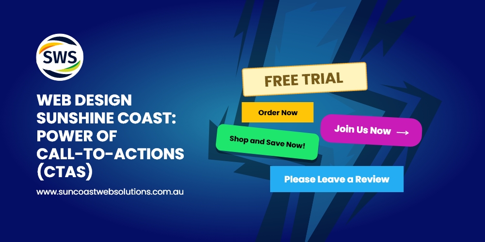
Unlock the potential of your website with expert CTAs! Discover how web design Sunshine Coast can boost engagement.
The Secret Sauce Behind Every High-Converting Website
Imagine this: You’ve spent hours crafting the perfect website. It’s visually stunning, loads quickly, and has all the right information. But something’s missing. Visitors come, browse, and leave without taking action. What went wrong? For businesses focusing on web design Sunshine Coast, the answer often lies in one critical element: Call-to-Actions (CTAs). When it comes to website design Sunshine Coast, CTAs are the bridge between a beautiful site and one that drives real results.
In this article, we’ll explore why CTAs are essential, how to create them effectively, and why web design Sunshine Coast experts consider them non-negotiable. By the end, you’ll have actionable strategies to transform your website into a conversion powerhouse.
Why CTAs Are the Heartbeat of Web Design
CTAs are more than just buttons or links—they’re the bridge between your audience and your goals. Think of them as digital signposts guiding users on what to do next. Without them, your website is like a store without a checkout counter.
No matter how appealing your design or content is, without an effective CTA, your audience may be left wondering, “What’s next?” They might love your site, but without direction, they may not take the steps necessary to convert into customers, subscribers, or engaged visitors.
The Role of CTAs in Web Design Sunshine Coast
On the Sunshine Coast, where businesses thrive on local engagement, CTAs are essential. They help:
Drive Conversions
Whether it’s signing up for a newsletter, downloading a guide, making a purchase, or booking a consultation, CTAs guide visitors toward action. In the competitive Sunshine Coast market, CTAs are often the final nudge needed to turn curious browsers into loyal customers. Think of a local Sunshine Coast café using a CTA like “Order Your Coffee Online Now!” to drive online orders. It directly leads to a transaction, boosting conversions.
Improve User Experience
Clear CTAs reduce confusion and enhance navigation by telling visitors exactly what to do next. Whether your CTA is asking users to “Learn More,” “Sign Up,” or “Shop Now,” it provides direction and makes your site more intuitive. When a user knows where to go next, they’re more likely to engage with your site and move through your conversion funnel.
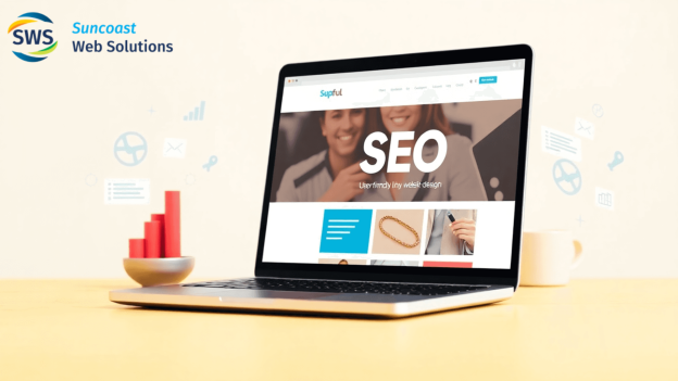
Boost SEO
Engaging CTAs don’t just benefit conversions—they also help with SEO. High quality CTAs reduce bounce rates and increase time spent on your site,
both of which are factors that signal to search engines that your site is valuable. Engaged users are more likely to share your content, interact with it, and visit again—all of which contribute to improved rankings.
For instance, a real estate agent in Sunshine Coast might use “Schedule a Property Tour Today!” as a CTA, engaging users and driving them deeper into their site. As users stay longer on the site, Google recognizes this as a sign of relevance, which can ultimately boost your site’s position in search results.
Crafting the Perfect CTA: Tips from Website Design Sunshine Coast Experts
Not all CTAs are created equal. A poorly designed CTA can frustrate users, while a well-crafted one can work wonders. Here’s how to get it right:
1. Use Action-Oriented Language
Your CTA text should be clear, concise, and action-driven. Avoid generic phrases like “Click Here” and opt for compelling, specific phrases like:
- “GetYour Free Quote Today!”
- “JoinOur Sunshine Coast Community!”
- “Downloadthe Ultimate Guide Now!”
By using action words, you guide your visitors on exactly what they should do next, increasing the chances of conversion.
2. Make It Visually Stand Out
Your CTA should be impossible to miss. Use contrasting colors, bold fonts, and strategic placement to draw attention. For example, a bright orange button on a blue background is hard to ignore. Additionally, don’t overcomplicate the design. Simplicity can be effective, so don’t shy away from using minimalistic designs that highlight the CTA button.
For a Sunshine Coast business, making the CTA pop visually can significantly improve click-through rates, ensuring that it catches the user’s attention immediately.
3. Keep It Above the Fold
In web design Sunshine Coast, placement matters. Ensure your primary CTA is visible without scrolling. This increases the chances of user engagement.
According to studies, the majority of visitors never scroll past the first few inches of a page, so placing your CTA at the top ensures it gets noticed immediately.
For instance, a local health and fitness business might place a CTA for “Book Your Free Consultation” at the top of the homepage to prompt visitors to take action right away.
4. Leverage Urgency and Scarcity
Phrases like “Limited Time Offer” or “Only 3 Spots Left!” create a sense of urgency, encouraging users to act quickly. People often hesitate to take action, but when they feel they may miss out on an opportunity, they’re more likely to make a decision faster. This sense of urgency can lead to higher conversion rates and prompt quicker actions.
5. Test and Optimise
A/B testing is crucial. Try different colors, text, and placements to see what resonates with your audience. For instance, a Sunshine Coast gym might test “Join Today for 50% Off!” versus “Start Your Free Trial Now!” to see which drives more sign-ups.
Through testing, you can refine your CTAs to ensure they are as effective as possible. Regular optimisation will allow you to stay ahead of trends and continually improve your site’s performance.
Common CTA Mistakes to Avoid
Even the best intentions can go awry if you fall into these common traps:
1. Overloading with CTAs
Too many CTAs can overwhelm users. Stick to one primary CTA per page to keep the focus clear. When users are presented with too many choices, they may experience decision paralysis, causing them to leave your site without taking any action.
While secondary CTAs can be useful, make sure your primary goal is always easy to understand and accessible.
2. Vague or Confusing Language
If users don’t understand what you’re asking, they won’t act. Be specific and direct with your CTA wording. For example, a vague “Learn More” could be misleading if users don’t know what they’ll actually be learning. Instead, use something more specific like “Download Our Free eBook” or “Find Your Dream Property Now.”
3. Ignoring Mobile Users
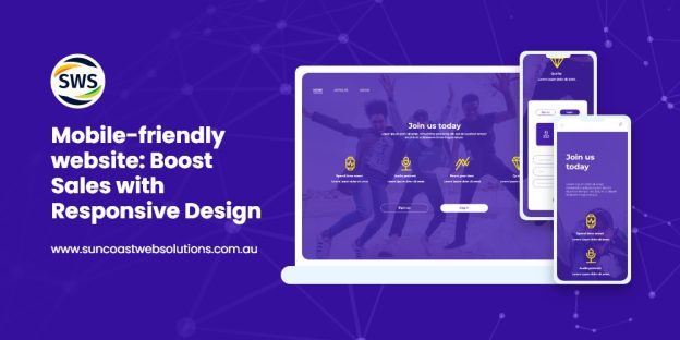
With most web traffic coming from mobile devices, it’s vital to ensure your CTAs are mobile-friendly. Buttons should be easy to tap, and text should be readable on smaller screens. Mobile optimisation is a must, as a significant portion of your audience may be accessing your site from smartphones or tablets.
Ensure that buttons are large enough to tap without error and that the layout adapts to different screen sizes. Websites that don’t consider mobile users risk losing a large chunk of potential business.
4. Forgetting to Align CTAs with Goals
Every CTA should have a purpose. Whether it’s generating leads, driving sales, or increasing engagement, make sure your CTAs align with your overall business objectives. For example, a real estate agent’s goal might be to capture leads, so the CTA might say “Get More Information About This Property.” A fitness center might want to drive sign-ups, so their CTA could be “Join Our 30-Day Fitness Challenge Today!”
When your CTAs are aligned with your business goals, every user interaction becomes a step toward achieving those objectives.
The Impact of CTAs on Website Design Sunshine Coast Success
CTAs aren’t just about aesthetics—they’re a strategic tool for growth. Here’s how they contribute to success:
1. Higher Conversion Rates
A well-placed CTA can significantly boost your conversion rates. For instance, a local Sunshine Coast café might use a CTA like “Order Your Coffee Online Now!” to drive online orders. By making the action clear and accessible, the business can convert more casual visitors into paying customers.
2. Enhanced User Engagement
CTAs encourage users to explore more of your site, reducing bounce rates and increasing engagement. For example, a “Read Our Latest Blog Post” CTA can encourage users to stay longer on your site, leading to more page views and interaction with your content.
3. Better ROI on Marketing Efforts
When your CTAs align with your marketing goals, you’ll see a higher return on investment. For example, a CTA like “Book Your Free Consultation Today!” can generate leads for a Sunshine Coast business, which can result in increased revenue and higher ROI on marketing campaigns.
Key Takeaways: Mastering CTAs in Web Design Sunshine Coast
Ready to transform your website? Here’s a quick recap:
- BeClear and Actionable: Use strong, direct
- Designfor Visibility: Make your CTAs stand out
- Optimizefor Mobile: Ensure they work seamlessly on all
- Testand Iterate: Experiment with different CTAs to see what works
- Alignwith Goals: Ensure every CTA serves a
Final Wrap Up & Key Takeaways
In today’s competitive Sunshine Coast market, the difference between a website that simply looks good and one that delivers real business results lies in powerful, persuasive CTAs. They serve as clear, engaging signposts guiding visitors exactly where you want them to go, turning casual clicks into committed customers.
By implementing strategic, visually compelling, and action-driven CTAs, you’ll unlock your website’s full conversion potential. Don’t wait another day to turn your website into your strongest sales asset.
Ready to transform your website into a conversion powerhouse?
Contact our expert web design team on the Sunshine Coast today, and let’s build a site that works as hard as you do!
WE ARE YOUR ONE-STOP INTERNET MARKETING SOLUTION ON THE SUNSHINE COAST!
GET IN TOUCH WITH US!
Related Posts