Suncoast Web Solutions
 24th Mar, 2025
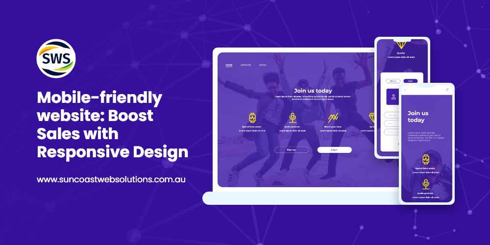
Have you ever tried browsing a business site on your phone, only to deal with impossible zooming and awkward scrolling? It’s a pain. That’s why having a mobile-friendly website is no longer optional. In today’s fast-paced digital world, people expect sites to adapt instantly to whatever device they’re using—whether that’s a desktop, laptop, tablet, or smartphone. That’s where responsive web design comes in.
In this post, you’ll discover the benefits of responsive design, why mobile-first website design can transform your customer experience, and how to maintain an SEO-friendly web design that ranks well in search results. By the end, you’ll have a roadmap for building a user-friendly website design that wins visitors’ hearts and wallets. Ready? Let’s dive in.
Why a Mobile-Friendly Website Matters More Than Ever
We live in a mobile-first world. People rely on their phones for work, shopping, entertainment, and more. If your site isn’t built as a mobile-friendly website, you risk losing potential customers who bounce off your pages the second they see a clunky layout. Here’s why this is so crucial:
- ImmediateImpression: Visitors judge your brand’s credibility within A poorly designed mobile experience sends the wrong message.
- WiderReach: The majority of online traffic now comes from mobile responsive web design ensures you’re welcoming that huge audience with open arms.
- SEOPerks: Search engines favor sites that adapt smoothly to all screen This boosts your organic visibility, making you easier to find.
Whether you’re a small startup or an established corporation, a mobile-friendly website helps you stay ahead of the competition. If people can’t quickly access your products or services on their phones, they’ll simply move on to someone else.
Key Elements of Responsive Web Design
Embracing Mobile-First Website Design
When you hear “mobile-first website design,” think of it as building from the smallest screen up. You focus on core elements that matter most to mobile users—like quick loading times and minimal clutter—then scale up for larger screens. This approach ensures no device is overlooked. It also helps you keep your site lean and efficient, which is essential for an SEO-friendly web design.
Flexible Grids and Layouts
A cornerstone of responsive web design is using fluid layouts. Rather than specifying fixed widths, you use percentages or responsive frameworks. This way, your site “flows” and automatically re-sizes as the screen gets bigger or smaller. The result? A mobile-friendly website that’s consistent across devices.
Responsive Images and Media Queries
Nothing ruins a mobile experience faster than images that don’t fit. By using responsive images, you allow them to scale smoothly to fit various screen sizes. Meanwhile, media queries in your CSS let you adapt font sizes, navigation styles, and page structures to each device’s dimensions. This fine-tuned control is what makes a user-friendly website design possible on any platform.
The Benefits of Responsive Design for Your Business
Choosing a responsive web design isn’t just a trendy tech move. It’s a strategic decision that can radically impact your bottom line. Below are some of the biggest benefits of responsive design:
1. Better User Experience and Higher Engagement
When people land on a mobile-friendly website, they’re more likely to stay and explore. This lowers your bounce rate and boosts the time spent on each page. A user-friendly website design also improves conversions—because fewer frustrations lead to more completed purchases or sign-ups.
2. Improved SEO and Discoverability
An SEO-friendly web design is one that search engines can easily crawl, understand, and rank. Google’s algorithm rewards mobile-friendly websites, meaning you have a better chance of appearing at the top of search results. This extra visibility can drive more organic traffic and, ultimately, more revenue.
3. Faster Page Load Times
When you adopt mobile friendly website design principles, you tend to simplify your site’s code, compress images, and strip away unnecessary elements. This not only helps mobile users but also speeds up your site on desktop. Faster load times are a key metric in user satisfaction—and in Google’s ranking criteria.
4. Streamlined Maintenance
Have you ever tried to manage separate desktop and mobile versions of the same site? It’s twice the work. With a single responsive web design, updates become simpler and less costly. Plus, you maintain brand consistency across all devices with minimal effort.
5. Higher Conversion Rates
A mobile-friendly website typically has user-friendly checkout processes, easy-to-tap buttons, and navigation that makes sense on smaller screens. This combination encourages visitors to take action—whether that’s signing up for a newsletter, booking an appointment, or making a purchase.
SEO-Friendly Web Design: The Key to Online Visibility
Ranking well in search results isn’t an accident. An SEO-friendly web design requires attention to details that make your site easy to crawl, fast to load, and engaging for users. Here’s how responsive web design ties into your SEO strategy:
- SingleURL for All Devices: A unified site is easier for search engines to index, and it avoids duplicate content issues that might happen if you maintain separate mobile and desktop URLs.
- ImprovedUser Signals: Metrics like bounce rate and time on page tell search engines how satisfied users are. A mobile-friendly website typically performs better in these areas, signaling to Google that you offer real value.
- FasterIndexing: When you have a mobile-first website design, you’re likely following best practices that also help search bots navigate your site more efficiently.
Actionable Steps to Build a Mobile-Friendly Website
Ready to roll up your sleeves and make your site shine on every device? Below are some hands-on tips to kick off your responsive web design journey.
1. Choose a Responsive Framework or Theme
Platforms like WordPress, Shopify, and Squarespace offer numerous responsive themes, while Bootstrap and Foundation are coding frameworks designed for mobile-first website design.
Starting with these pre-built solutions saves time and ensures your base is already user-friendly.
2. Prioritize Page Speed
An SEO-friendly web design hinges on speed. Compress your images, minify your code, and leverage browser caching to make pages load fast. Use tools like Google’s PageSpeed Insights to check for any bottlenecks.
A swift, mobile friendly website helps you keep visitors engaged and improves your search rankings.
3. Simplify Navigation
Mobile screens are small, so stick to concise menus. A clean, collapsible navigation bar (or “hamburger menu”) helps users find what they need quickly. This makes for a user-friendly website design that doesn’t frustrate visitors with endless scrolling or hidden menu items.
4. Test Across Different Devices
Never assume your site looks great on all screens just because it seems fine on yours. Grab a phone, a tablet, and a laptop—test your site on each. Also consider free testing tools that simulate various screen sizes. Catching a glitch early can save you from losing potential customers.
5. Keep Forms Short and Sweet
If your site relies on form submissions (like contact forms or email sign-ups), keep them brief for mobile users. People are less likely to fill out long forms on a phone. A well-crafted, mobile-friendly website removes friction and makes it simple for visitors to reach out or sign up.
Common Mistakes (and How to Avoid Them) in Responsive Web Design
Even with the best intentions, it’s easy to slip up when creating a mobile-friendly website. Let’s address common pitfalls:
Mistake 1: Ignoring Mobile-First Website Design Principles
Some businesses still design for large screens first and then try to shrink everything. This often leads to cluttered mobile layouts. Always consider the smallest screen first to ensure an efficient, user-friendly website design.
Mistake 2: Overusing Large Images or Videos
Media elements can slow down page load times if not optimized correctly. Compress images, consider lazy loading, and make sure videos don’t autoplay on mobile. Remember, speed is crucial for an SEO-friendly web design.
Mistake 3: Burying Important Calls to Action
On a phone, you have limited space. Keep your “Buy Now” or “Sign Up” buttons clearly visible, and place them where visitors can easily tap. If users have to scroll endlessly, they might leave before taking action.
Mistake 4: Not Testing Forms and Buttons on Mobile
A clickable button on desktop might be tiny on a phone. Always check that your interactive elements are large enough and properly spaced. This ensures your mobile-friendly website really is friendly to the thumbs and eyes of your audience.
Leveraging Mobile-First Website Design to Stand Out
So why is mobile-first website design so powerful? Because it forces you to prioritize what matters:
- CoreFunctions: What do users need to see first? When you design from a mobile standpoint, you highlight key actions—like signing up, booking, or purchasing.
- Leanand Clean Layouts: With less space, you’re compelled to keep only essential elements on the This results in a more user-friendly website design and a faster site overall.
- StrategicSEO Focus: Google’s mobile-first indexing means the mobile version of your site is the baseline for ranking. By optimizing for mobile, you’re simultaneously creating an SEO-friendly web design for all devices.
How Responsive Web Design Boosts User Loyalty
Once people have a smooth experience on your mobile-friendly website, they’re more likely to return. Here’s how responsive web design drives loyalty:
- ConsistentBrand Experience: Whether someone visits on a phone, tablet, or laptop, they recognize your brand. That consistency builds trust.
- LowerFrustration: A site that just works—without pinching, zooming, or sideways scrolling—keeps users happy. Happy users come back.
- PersonalRecommendations: People share good If they love how easy your site is to use, they’re more inclined to recommend you to friends or colleagues.
Real-World Results from a Mobile-Friendly Website
It’s one thing to talk about theory. It’s another to see real outcomes. Here are quick examples of how adopting a responsive web design can pay off:
- LocalRestaurant: They upgraded to a mobile-first website design, making online reservations Result? A 30% jump in booked tables from mobile devices and glowing customer reviews about easy navigation.
- E-commerce Store: After implementing an SEO-friendly web design, load times improvedby 40%. That change boosted search engine rankings and led to a noticeable increase in sales—mostly from mobile customers.
- FreelancePortfolio: A graphic designer streamlined her site to become a truly
mobile-friendly website. Clients found it easier to browse her samples on phones and tablets, resulting in more project inquiries and faster hiring decisions.
These examples may vary by industry, but the core message is the same: when you invest in responsive web design, you typically see tangible returns.
Actionable Tips for Maintaining an SEO-Friendly Web Design
Creating a mobile-friendly website is just the start. Keeping it in tip-top shape is an ongoing process. Here’s how to maintain your responsive web design effectively:
1. Regularly Update Plugins and Themes
If you’re using a content management system, make sure your plugins and themes are up to date. Developers often release patches that improve performance and fix security flaws. Updates also preserve your user-friendly website design on new device releases.
2. Monitor Page Speeds
Use tools like Google Analytics or Lighthouse to keep track of loading times. If you notice a slowdown, investigate. It could be a heavy script or unoptimized image sneaking in. Fast pages keep your mobile-friendly website competitive.
3. Ask for User Feedback
You can’t fix what you don’t know is broken. Encourage visitors to share their experience on your site. Whether through social media polls, feedback forms, or direct email, user insights can clue you in on areas for improvement.
4. Optimize for Core Web Vitals
Google’s Core Web Vitals measure things like how long it takes for the largest element to load and how visually stable the page is. An SEO-friendly web design that excels in these metrics is more likely to rank well.
Myths and Misconceptions About Responsive Web Design
Some folks still hesitate to invest in a mobile-friendly website. Let’s tackle a few myths head-on:
- “WeDon’t Need Responsive Web Design Because We’re a Small” Even small businesses benefit from broader mobile reach and better SEO.
- “ResponsiveMeans ”
Yes, there can be costs, but frameworks and pre-built themes make it more affordable than ever. The long-term gains outweigh the investment. - “SpeedWill Suffer with a Responsive ”
If done correctly, a mobile-first website design is often faster because you’re forced to keep things lean. - “DesktopExperience Doesn’t Matter ”
That’s not true. A responsive web design includes an excellent desktop layout too. It’s about adapting across all devices, not ignoring one for another.
Crafting a User-Friendly Website Design That Converts
User-friendly website design is about more than just color schemes and fancy fonts. At its core, it’s about understanding your audience’s needs and meeting them without hassle. Here’s how to streamline user experience:
- IntuitiveLayouts: Group related information If users can predict where to click next, they’ll feel more at ease.
- ReadableText: Stick to fonts that are large enough and high-contrast. Nobody wants to squint at their screen.
- ClearCalls to Action: Let visitors know exactly what you want them to do—Buy Now, Learn More, Sign Up—without making them hunt.
- AccessibleDesign: Consider users with visual or mobility Adding alt text for images and ensuring proper heading structure can make your mobile-friendly website accessible to everyone.
Wrapping It Up: Why Responsive Web Design Is Non-Negotiable
We’ve explored the ins and outs of mobile-friendly website strategies, from benefits of responsive design to mobile-first website design principles. By prioritizing responsive web design, you’ll create a user-friendly website design that not only pleases visitors but also satisfies search engines. That double-win helps you stand out in a crowded market, boosting your brand image, SEO rankings, and overall conversions.
In the end, an SEO-friendly web design isn’t just about technical details—it’s about treating your audience with respect. You’re showing them you value their time, whether they’re on a large desktop monitor or a tiny phone screen. That kind of dedication fosters loyalty and trust, translating into real-world growth for your business.
So, what’s your next move? Will you re-evaluate your site’s layout?
Will you switch to a mobile first website design approach? Or maybe you’ll start with a few small changes—like compressing images and testing your buttons on mobile—to steadily inch toward a more responsive web design. Whatever you decide, remember that a mobile-friendly website is no longer optional. It’s the key to thriving in an ever-evolving digital landscape.
WE ARE YOUR ONE-STOP INTERNET MARKETING SOLUTION ON THE SUNSHINE COAST!
GET IN TOUCH WITH US!
Related Posts